
Winks Hardware Website
Designing e-commerce for a small business
It can be difficult for a local hardware store to compete with big box stores like Lowes and Home Depot during normal times. But this is especially true during a pandemic, even for Winks Hardware Store, a century-old institution in Portland, Oregon known for its specialty hardware and unmatched customer service. Unfortunately, the current Winks website is disorganized and lacks modern e-commerce functionality. This needs to change.
The Challenge
How might we design a new responsive e-commerce website for Winks Hardware that meets the particular needs and goals of their customers?
Project Overview
DURATION:
Two weeks
MY ROLE (solo project):
research
visual design
testing and iteration
METHODS:
User Interviews
Contextual Inquiry
Affinity Mapping
Heuristic Analysis
Competitive/Comparative Analysis
Journey Map
Card Sort
Site Map
User Flow
Sketching and wireframes
Interactive Prototype
Usability Testing
Discovery
The approach
After some initial research I learned that Winks aimed to draw customers with unique hardware selection and knowledgeable staff. But what were the needs and goals of their customers that would be using this new website?

Winks’ existing site lacks e-commerce capability
Empathizing with Winks customers
In order to better understand Winks’ customers I decided to:
Analyze online reviews of Winks
Interview four users of local hardware stores
Conduct contextual inquiries of Winks’ current website

Key insights about the users emerged from affinity mapping:
Users are comforted that their local store stocks their favorite brands.
Users love it when an expert on staff can answer their questions.
They get annoyed when they can’t find something on a website.
They are frustrated when a website feels disorganized.
A pragmatic persona
These insights helped me focus on the persona for whom I’d be designing.
Meet Tyler, a pragmatic handyman who is proud of his reputation as a reliable and skilled craftsman. He values Winks for their wide selection of specialty fasteners and knowledgeable staff.
Imagine this scenario: Tyler is building a deck for a new client and would like to purchase specialty fasteners from Winks before he starts. But the website is disorganized and it isn’t capable of processing online orders or displaying which items are in stock. Now he’s anxious that Winks won’t have what he needs and it might make him late to meet his client.

Tyler, the local handyman
“I appreciate genuine customer service from people who can look me in the eye.”
Middle class dad in his mid-thirties
Owns a small home near Portland, OR
Earns $75K annually on light renovation jobs
Enjoys microbreweries and disc golf
The Problem
Tyler needs an intuitive way to check if Winks has the hardware that his client needs so that he can feel confident he will complete his job on time.
Revamping the Information Architecture
The first step towards solving this problem was to learn more about how Tyler might organize the contents of a hardware store so that the site navigation would fit his mental model. I conducted an open card sort with nine people who had shopped at a hardware store recently. They sorted 60 items into groups and then named these groups.
I analyzed these groupings and synthesized them into eight product categories for the new site map. Ideally I would have verified these categories in a closed card sort but due to time constraints this step would need to be pushed back until later.
Winks versus the competition
Before I began designing, I decided to take a look at Winks’ online competitors, both direct and indirect. I analyzed how they organized their homepages and processed their customers orders. Our persona Tyler had a short amount of time to complete his task, so I imagined that a cleaner, less cluttered website would be more navigable for him. I hypothesized that my target lay somewhere between the minimalist website of Warby Parker and the denser yet organized website of Lowes. I also thought Tyler would appreciate elements of Nike’s streamlined checkout process with its intuitive autofill feature.

I analyzed home screen layouts and checkout screens of Winks’ indirect competitors.
Design
User Flow
I was now ready to start turning the research data into a visual interface. In order to focus only on the screens I would need for my interactive prototype, I created a user flow of Tyler’s checkout process.
Designing the interface
I began sketching possible UI layouts for this checkout process with these thought starters:
How might we structure the Winks’ website in a way that our persona Tyler will find intuitive?
How might we display whether items are currently in stock?
How might we reassure Tyler that he’ll get the supplies he needs ?
How might we streamline Tyler’s checkout process to get him back on the job site ASAP?


Sketching multiple solutions for product pages and home pages.
As I sketched variations of the home, product and checkout pages, I included features that I noticed during the competitive analysis:
product inventory badges
streamlined checkout processes
a limited number of links in the header
On the product description page, I decide to place the name of the product above the price (unlike Lowes or Home Depot) to reflect the importance of brands to Tyler’s experience.

Desktop wireframe showing new product categories

Product page with “in stock” badge and in-store pickup option

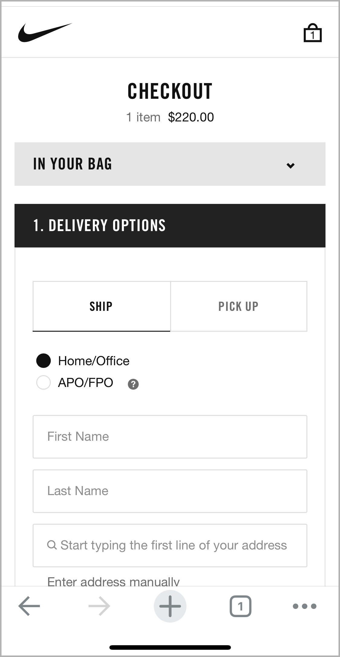
Checkout screen
Usability Testing Results
I was excited to find that during testing all five users were able to successfully locate and purchase the specialty fasteners that our persona Tyler needed for his job. Instead of giving up in frustration like several did previously, 60% of users actually said, “That was easy!” when they completed their task.
There was still room to iterate, however - specifically on the final checkout page. 60% of the users skipped over the step of entering the CVV credit card code during checkout and were confused why they couldn’t complete the transaction.
Iterating the checkout screen
To address this problem, I took some inspiration from the Nike checkout process and introduced the equivalent of a progress bar to the checkout page. A checkmark lets the user know what steps they have completed and an arrow points out the next step.

An iteration of the checkout screen to help users follow checkout steps

Conclusion
Next steps
Conduct a closed sort to validate the product categories that I derived.
Perform usability testing focusing on the next iteration of the checkout process.
What I learned
As a motion designer, designing wireframes and a prototype felts natural and I wondered about how to make even higher fidelity prototypes.
It’s deeply satisfying to hear the delight in a user's voice when the prototype makes intuitive sense to them.
I knew that I’d enjoy designing the UI but I was surprised by the excitement I felt during user interviews. The stories, experiences and feelings that they shared gave my work a sense of urgency and purpose.